Flint Ross Moorhouse


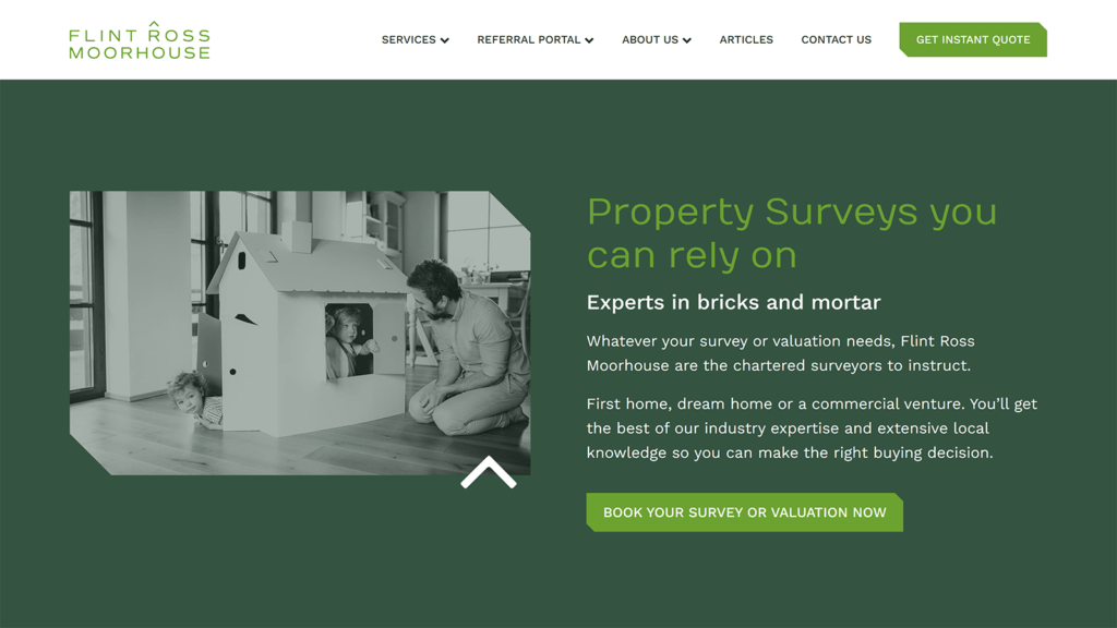
Before I entered the project there was already a graphic designer working on their new visual identity. She was also set to design their website. Although her work with graphic design was magnificent, she was not very experienced with web design. For that reason, the first thing I did in this project was work on the basic user experience of it. I created the wireframes and delivered them to the designer so she could follow them to create the final design.
In my opinion, the final result was perfect.
The development process was very straightforward.
In the front-end, some of the visual elements required certain attention to look just like they were designed.
In the back-end, to accelerate the process I decided to create flexible and customizable blocks of sections that would have similar look throughout the entire site. This workflow allowed me to gain time and, as a bonus, the client would be able to edit the pages with extra ease.